Hello,
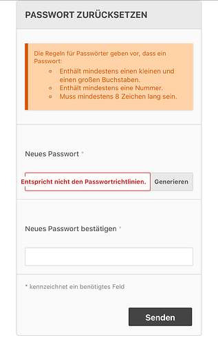
do you know how to move the validation message from the (password) field itself to above or bellow.
here is an example of what is happen when start writing. (on phone or small screen).
I found a solution from Wakas:
which is to add the following tag in CSS
this can be achieved by adding “top:50%” property for .LV_validation_message in core\resources\assets\css\theme.min.css
Thank you Wakas!

then the validation message looks as needed.
Note: to see the updated style, the cashes need to be deleted (Home > System Admin > Cache Manager).
Hi @Abbadi Thanks for sharing the solution you found, especially given that these translated validation strings can be much longer than the original version in english. This looks like a good solution that works well with the interface. As luck would have it, I’ve been working on some UI improvements for forms and validation lately, so I’ll be sure to keep this consideration in mind for the updated UI.

