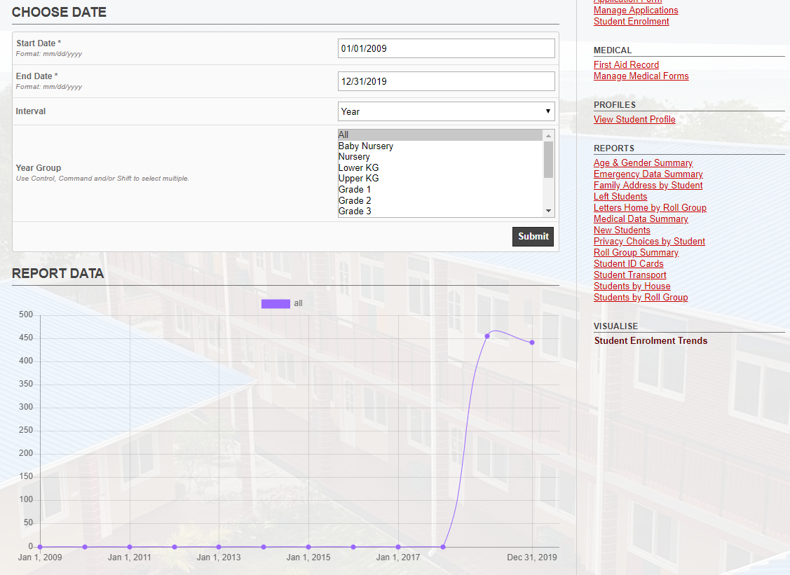
We started using gibbon lately this year and we imported enrolled 450+ students for this year.
But except for a few students, most of them joined school in between 2009 and 2019.
I have school years starting from 2009 till 2020.
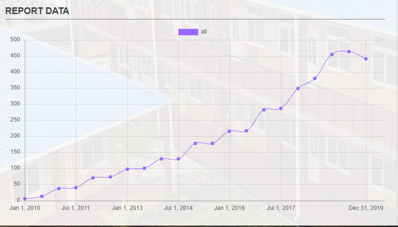
Imported students school admission date and joined year group to [Start Date] and [Class Of] accordingly.
This is our current visualization from 2009 - 2019
Hi Ahmed, importing the student records is a good start, but they need to be enroled in each of the relevant school years. You can do this by hand by logging into past years and manually enrolling, or by going to Admin > System Admin > Import From File and using the Student Enrolment import. Cheers, Ross.
The difference you’re seeing may be that it’s showing the cumulative total, so 11 new students in one year would add up to the total enrolment that is shown.